General Overview
General Overview
Welcome to this Microsoft Excel Basic Visualizations help guide*. This guide will provide information on:
- how to create various types of visualizations in Excel;
- how to lightly format those visualizations.
For information on how to format and organize your data as well as how to create basic formulas, click here to access our Microsoft Excel Basic Guide. If you would prefer to consume much of the material offered in these two guides via a video, you can click here to view my Excel Intro Video for Beginners.
Basic components of an Excel visualization
Visualizations (oftentimes called charts or graphs) are visual representations of data. There are many types of visualizations which are each best suited for specific purposes.
- Visualizations typically have a title which either explains the nature of the data (example: Units Produced from 2017 to 2021) or make a point about something in the data (example: Drop in 2020 unit production due to supply chain issues)
- Visualizations are oftentimes, but not always, plotted on an XY diagram. In such cases, there is a Y axis (vertical increments) and an X axis (horizontal increments). These types of visualizations are oftentimes called graphs but Excel uses the chart descriptor for all visualizations. For consistency, we will adhere to the term "chart" throughout this guide.
- Data labels reveal something about the dataset (value, name, percentage, etc.). They can appear for a specific data point or for the entire data series.
- Legends indicate the name of the data series and can be placed in various areas of the chart.
*Compatibility
It is important to know that Excel is not a static program and does come in many different flavours: Excel for PCs has various versions and while most of the functionality is retained from one version to the next, each iteration creates some changes to the platform. Excel also has a program for the Apple computer which has its own idiosyncrasies. Additionally, Excel has an online program which has has a truncated set of features compared to its PC counterpart. Finally, while not an Excel product, other spreadsheet programs (such as Google Sheets) do have many of the same features as the ones we will be discussing in this help guide. Please be aware of the program and version of Excel you are using. For your reference, we will be using Excel for Microsoft 365 (PC version) as our help guide version.
Line and Area Charts
Line and area charts
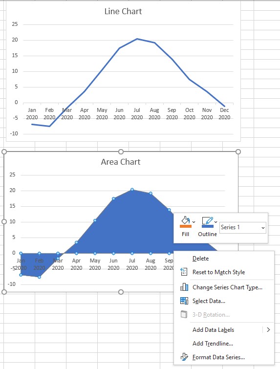
Line charts and area charts are useful to compare data over time (time series data). See below for a few examples of such charts.
To create one:
- Highlight the desired data.
- Click on the Insert Line or Area Chart command button in the Charts grouping of the Insert tab ribbon.
- You can click on any of the 2D or 3D line or area chart example to insert it in your spreadsheet.
- Hint: Hover over the images to see how you data would appear using the various examples provided.
- To change the title, simply double-click on the title text and change it to best represent the chart.
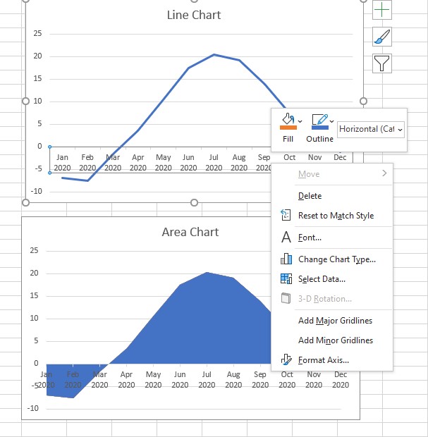
To modify the label position an any axis,
- Right click on the axis you wish to modify
- Select "Format Axis" in the dropdown menu
- Click on the Labels submenu
- Change the label position to "Low"
To modify the color of the data,
- Right click on the data portion of the graph
- Choose a fill color and an outline color for your chart by clicking on the first two icons of the menu bar.
- Hint: You can find many other ways to tweak your data by pressing on the Format Data Series option of the menu bar.
This is the result of making these two small changes to your chart:
Bar and Column Charts
Bar and column charts
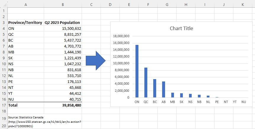
Bar (horizontal) and column (vertical) charts are useful to compare data over categories. See below an example of a column chart.
To create one:
- Highlight the desired data.
- Click on the Insert Column or Bar Chart command button in the Charts grouping of the Insert tab ribbon.
- You can click on any of the 2D or 3D column and bar chart example to insert it in your spreadsheet.
- Hint: Hover over the images to see how you data would appear using the various examples provided.
Formatting tips
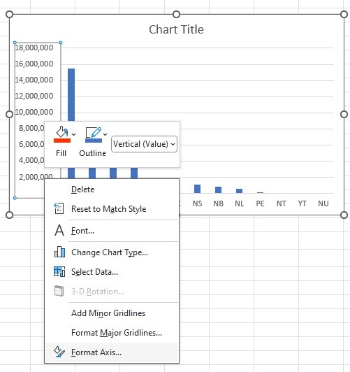
To modify the numbering (minimum value, maximum value, value interval) an the y axis,
- Right click on the axis you wish to modify
- Select "Format Axis" in the dropdown menu
- Set the minimum (we left this at 0), the maximum (we changed this to 16 million), and the interval (we changed this to 4 million).
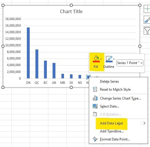
To modify the color and label of the data,
- Right click on the data portion of the chart.
- The first time you click, the entire data will be highlighted. This is perfect if you wish to make changes of the entire dataset.
- Click on a particular data (we chose NB) to change that part of the chart and leave the rest as is.
- Right click to activate the side menu bar.
- Choose a fill color and an outline color for your chart by clicking on the first two icons of the menu bar.
- Click on the "Add Data Labels" option.
This is the result of making these two small changes to your chart (and altering/bolding the title):
Pie and Doughnut Charts
Pie and doughnut charts
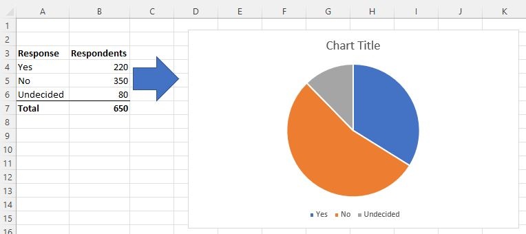
Pie or doughnut charts are useful to compare data as a portion (or percentage) of a whole. See below for an example of a pie chart.
To create one:
- Highlight the desired data.
- Click on the Insert Pie or Doughnut Chart command button in the Charts grouping of the Insert tab ribbon.
- You can click on any of the 2D or 3D pie chart or the 2D doughnut chart examples to insert it in your spreadsheet.
- Hint: Hover over the images to see how you data would appear using the various examples provided.
Formatting tips
To create and modify the data labels and to change the color of a chart,
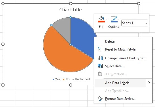
- Right click on the pie chart itself to activate the side menu bar
- Click on the "Add Data Labels" option.
- Then right click again and choose the "Format data labels" option
- From there, choose the labels you wish to appear on the chart. In this example, "Category name" (response type) and "Percentage" were chosen.
- To change the color of the chart, right click on the pie chart
- Choose a fill color and an outline color for your chart by clicking on the first two icons of the menu bar.
This is the result of making these two small changes to your chart (as well as altering/bolding the title and removing the bottom legend):
Scatter and Bubble Charts
Scatter and bubble charts
Scatter charts are useful to compare data that has two numeric variables. See below for an example of a scatter chart.
To create one:
- Highlight the desired data (x and y values).
- Click on the Insert Scatter or Bubble Chart command button in the Charts grouping of the Insert tab ribbon.
- You can click on any of the scatter or bubble charts examples to insert it in your spreadsheet.
- Hint: Hover over the images to see how you data would appear using the various examples provided.
Formatting tips
You will notice that the data appears compressed on the original scatter plot. To change this, simply modify the numbering (minimum value, maximum value, value interval) an axis by:
- Right clicking on the axis you wish to modify
- Selecting "Format Axis" in the dropdown menu
- Setting the minimum and maximums (we left this at 0 and changed it to 16 on the y axis and 68 and 88 on the x axis), and the interval (we left this unchanged on both axes).
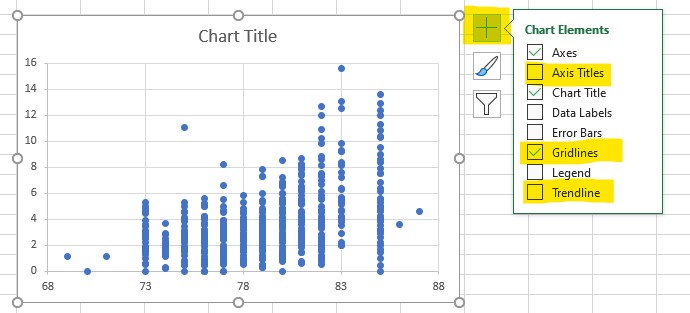
You can also make other formatting modifications by clicking anywhere on the chart and pressing the "+" button on the top right corner:
In this case, we added axes titles in order to better orient the audience. We also removed the gridlines and added a trendline to express the pattern inherent in the dataset.
This is the result of making these four small changes to your chart (as well as altering/bolding the title):
Subject Specialties:
Data analysis,
Data visualization,
Support with MS Excel.
Last modified on November 14, 2023 13:16
Share